It all started when Silk published this tweet yesterday afternoon with a chart created from their site using a dataset of NFL arrests since 2000.
This Silk database covers the arrests and citations involving #NFLPlayers since 2000. https://t.co/aJS31HTbtu pic.twitter.com/LvZOOWczt1I retweeted this and then followed up with a tweet of my own.
— Silk (@SilkDotCo) September 22, 2014
LRT how NOT to do pie charts
— Robb (@robbtuftshockey) September 22, 2014
What followed was an engaging conversation between one of my friends, the Silk account, and myself about chart types and dataviz best practices. And while I am not very good at dataviz makeovers, this one was simple. Turn this pie chart into a horizontal bar chart sorted descending.
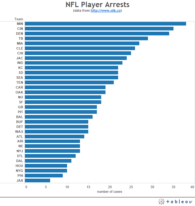
This is a much cleaner look at the data and it is easier to see the most, least, and the overall distribution of arrests between teams in the NFL. However, this doesn't tell the whole story. If you look into the data, you start to see some players are arrested on more than on occasion which can skew the results. We might also want to look at the reasons for the arrest, the outcomes, and perhaps the positions of the players being arrested.
So this prompted me to create a quick dashboard to better explore this data. Unfortunately, I sized the dashboard for landscape iPad which means it won't embed properly into this post. So click on the image below to take you to the dashboard where you can interact with it.

Minnesota might have the most arrests, but it is clear that they also have a number of players with repeat arrests. Wide receivers have more arrests than other positions in the NFL. And the top three arrest categories are DUI, domestic violence, and drugs.
Some quick notes about the design. First, the arrest category field had multiple values for some players. For instance, if you look at the summary box, you'll see players that have DUI, drugs listed as the category. I grouped the categories together based on the first value listed. For example values like "DUI, drugs", "DUI", "DUI, guns" were all grouped together under "DUI" for the tree map on the right. I chose to group on the first value under the assumption that that value was the primary reason for the arrest. I know that I might catch some critique for using the tree map and packed bubble charts. I chose the tree map because I wanted to show part of the whole and also I wanted to make it visually interesting. I think a horizontal bar chart might be more appropriate, but not as visually appealing. With some of the visualizations I have been creating lately for hockey, I've been skewing more towards the pretty side of useful/pretty because I have to be able to catch people's attention. But at the same time I want to make sure my visualizations are accurate. In this case I think the tree map works well. The packed bubbles is probably a little more controversial of a chart choice, but the same reasoning as before applies for this. I wanted something that would be visually appealing while still telling an accurate story. You can easily see how certain positions are arrested more than others, and the coloring adds some additional variation to the visualization and makes it a bit more "playful" looking.
Let me know what you think!
No comments:
Post a Comment