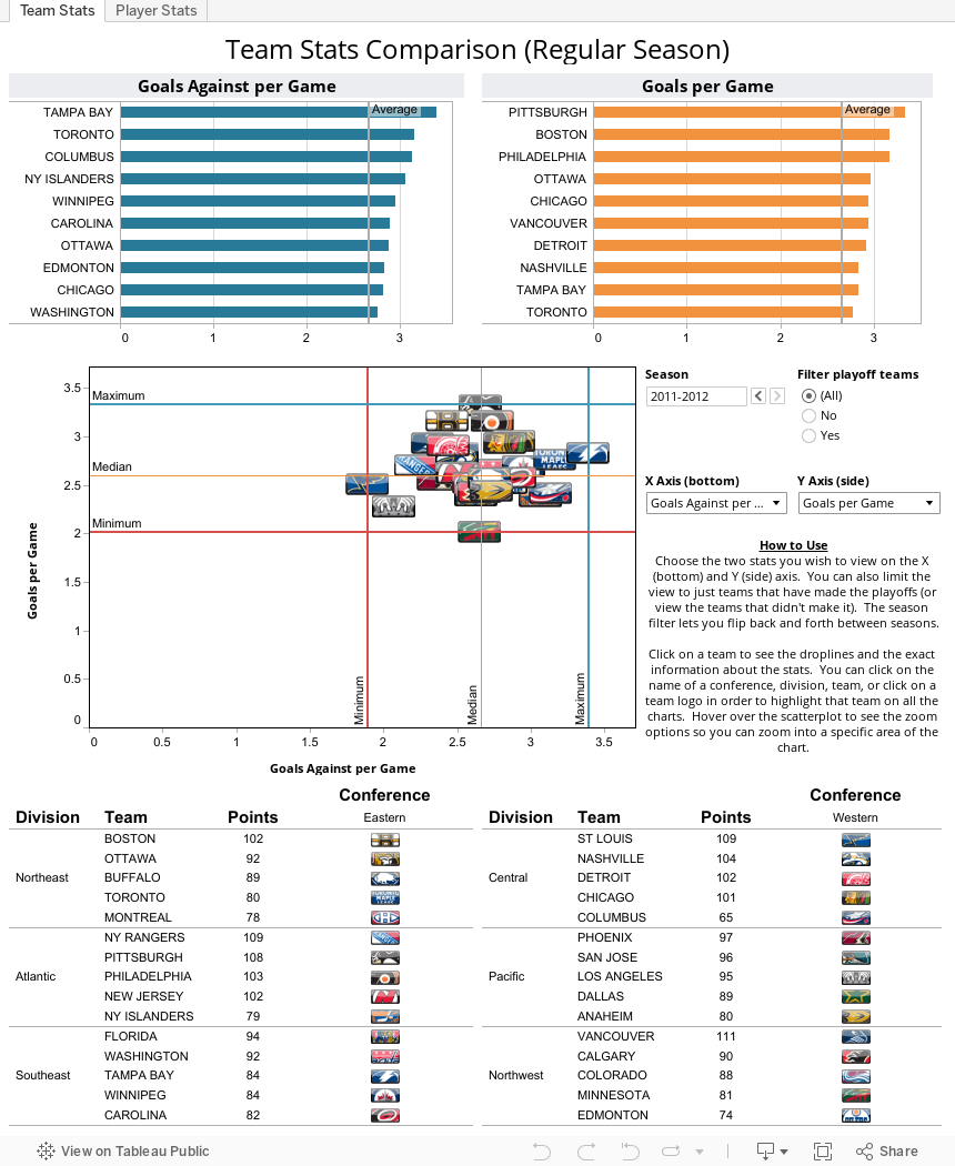
The main difference between my original 2010-2011 player stats and v2.0 is the addition of team stats. So there are two tabs; one for team stats and the other for player stats. The one thing I didn't change from the original version is the scatterplot. I kept that for both the player and team stats. However, I did add bar charts so you can better view the two stats you choose independently of one another.
One of the problems with using the scatterplot for the players stats was the number of players really made the chart look busy. I added more filters to the players stats viz so you have various ways to reduce the number of players visible in the scatterplot. It also allows you to compare just two teams or view players within specific divisions or conferences.
As far as the design of v2.0, I stripped it bare. I was inspired by Paul Rodriguez's blog Data About Sports. He did a hockey data viz that was simple, clean and used team logos. I always try to make things too complicated, especially when it comes to the look of my data visualizations. So I kept v2.0 simple and clean. Instead of using team logos, I used the "jewels" or buttons that the NHL and NHL teams use on their website. I like the jewels better than the logos because the jewels are uniform in shape and they were much easier to find, download, and import into Tableau than logos were.
Check out the two visualizations below. Click on team names or logos or players names to highlight those teams or players. There are zoom controls when you hover over the scatterplots. Check out the one that looks like a square with a "+". You can use that to draw a box for a zoom-in.
Leave a comment and let me know what you think about this updated visualization. Thank you for reading my blog.
Hi Robb,
ReplyDeleteI've been meaning to comment on this for a while now - I think this is an awesome dashboard that facilitates data exploration - it is super easy to compare any two metrics against each other, and I like the options to make the player chart more "readable" by filtering based on a number of different criteria.
I feel like I could use this dashboard as a resource to answer many different questions about player and team stats in the NHL.
I was surprised to see such a strong correlation between goals and shots (your default settings), which seems to indicate that even less productive players could score more if they pulled the trigger more often. All except Dan Boyle that is - what's up with his goals to shots ratio?
I tend to prefer round shapes in scatterplots, probably b/c I have a better sense of where the "middle" is, so I find the pearl shapes good-looking but somewhat harder to read. This is a minor point, and more an aesthetic preference than anything else.
Thanks for sharing Robb, and awesome stuff.
Ben
Ben,
ReplyDeleteThank you very much for taking a look at the viz and for your great comment. I am hoping this might be a useful tool for hockey fans to pick their players for their fantasy teams next season.
I agree that round shapes can be better for finding the center. I went with the pearl shapes to add a more dynamic visual look to the viz. I know that is a debate within the viz community, but I think something like these pearls, while not perfect, sort of bridge the gap.
As far as Boyle is concerned, take a look at his assists and his plus/minus. He has the second most assists for the Sharks this season and is ranked 4th in plus/minus. Hockey stats gurus will tell you that plus/minus is not a very compelling stat. However, I think when you place it in a context alongside other stats, it provide a quick understanding of the player's role on the team. In this case, Boyle might be missing most of his shots, but I would guess that his missed shots are turning into rebounds which are then turning into goals.
I spoke with the hockey stats guru I referenced in the first paragraph and he suggested some additional, more specific stats, that I should take a look at for future viz. I will probably update this again after the playoffs to include playoff stats, and additional "fancy stats".
Thanks again for the great comment and congratulations to you for winning the Crowd Favorite award in this year's Biz Viz contest!
Nice! and thanks for the Shout out!
ReplyDeleteHello, I love reading through your blog, I wanted to leave a little comment to support you and wish you a good continuation. Wish you best of luck for all your best efforts.
ReplyDeleteTableau Guru
http://www.sqiar.com/data-hosting/