The Chesapeake Bay is the largest estuary in North America. At one time it was teeming with fish, crabs, and oysters. However, after centuries of water pollution, air pollution, over-development along its shores, over-fishing, and agricultural runoff, it is currently in a very distressed condition.
I am currently conversing with a local watershed group about using Tableau as a tool to visualize the data that this specific local group collects about their waterway. People are always wanting to know the condition of the waterway either out of general concern, or because they want to know if it is okay to swim or fish in the water. During our initial conversation they recommended that I take a look at the data that the Chesapeake Bay Program makes available to the public. So I downloaded a set of data focusing on three primary metrics: dissolved oxygen, secchi disk depth, and water temperature.
Dissolved oxygen is an important metric regarding the health of the Chesapeake Bay because the creatures living in the bay need oxygen to survive. No oxygen and the fish and other animals who live in the waters of the bay begin to die. According to the "Breath of Life" newsletter published by NOAA and the Chesapeake Bay Program, 5 milligrams per liter of dissolved oxygen is required for most aquatic life to thrive.
Oxygen levels below 1-2 mg/L, even if only for a few hours, can cause large fish kills.
Secchi disk is a disk segmented into alternating quarter panels of black and white. The disk is attached to a string and then lowered into the water. The moment the individual can no longer see the disk in the water, the string is marked at the waterline and pulled back up and measured. The distance between the waterline mark on the string and the disk is the secchi disk depth.
Finally, I included water temperature because we know that water temperature can affect water quality and dissolved oxygen. It also provides some contexts as well to the readings and it is a metric that most people can easily identify and understand.
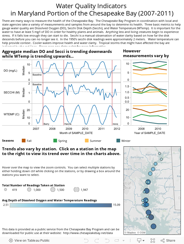
I added a few reference points to the monthly trend chart. The dotted lines are the trend lines and I marked the minimum level of DO in the DO portion of the trend chart. I also marked the three tropical storms that had affected the Chesapeake Bay between 2007 and 2011.
Ultimately, this is a demo viz to show the group I am talking with about the type of interactive visualizations we can make for the public in order to use their data to tell the story of the body of water for which they have assumed responsibility. Any thoughts from the Tableau or dataviz community would be welcome as I hopefully move forward with this project with them.
And as always, thanks for taking the time to check out my blog.
Update: After going live with this, I began to rethink the design and text that accompanied the viz. I opted to go with a cleaner, more straightforward viz that does not use a scatterplot (for once). Those who have access to Tableau can download the workbook to view my original viz. I think you will find this updated version is much better.
Thank you to Ted W., Rob S. and Erik M. for their editorial and technical assistance with the science.
Hi, Robb.
ReplyDeleteSweet. The colors for the seasons on the season time series are right on, and intuitive after going through the tooltip on each. Yellow for Summer, blue for Winter, green for Spring, red for Fall. Is there any space, though, to add a seasons legend, or label the line ends on one of the panels in that view?
Michael,
DeleteThanks for taking a look at the viz and for the comment! I'm glad the seasons seemed intuitive (even if you had to view the tooltip).
I originally had the legend in and had it to the right side of the chart, but it scrunched up the monthly aggregate chart too much. I also had it underneath as a single row, but then it wasn't quite lined up with seasons chart. I knew not having that legend was the one weakness with this. I'll put the legend back in as a single row underneath. It isn't ideal, but I guess better than nothing!
Robb