Friday, September 22, 2017
Snallygaster 2017
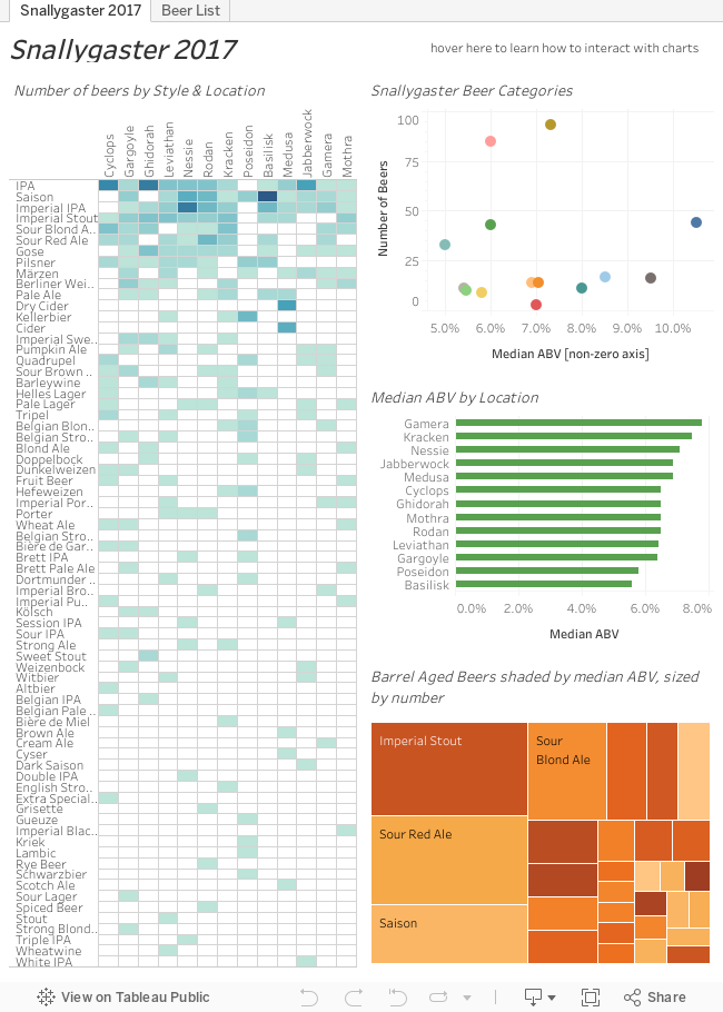
Snallygaster is one of the best beer festivals in the Mid-Atlantic region and I am grateful that they publish their list of beers in a handy excel sheet so dataviz geeks like me can play with it.


Thursday, September 15, 2016
Snallygaster Beer Finder Dataviz
Snallygaster is the best beer festival in the DC metro area. There is no doubt about this. Not only are there hundreds of delicious beers, but the event is to raise money for the local urban gardening non-profit Arcadia. (Yes, please click on that link and check out what they do.)
The map of the US has zoom controls that appear in the corner when you hover over the map. This way you can better zoom in to the east coast where most of the beers originated. By the way Virginia breweries (including collaborations) are bringing the most beers to the event on Saturday. However, each collaboration is treated as a unique brewery so keep that in mind as you are perusing the list and analyzing the results of your "analysis."
For those of you who might be looking for lower ABV beers (there is no shame in that whatsoever) you can use the ABV distribution chart. Not only can you click on the individual bars to view the beers with that ABV, but you can hold the ctrl key while selecting additional bars, or draw a box around the ABV bars you want to select.
As you can see there are lots of ways you can interact with this beer finder dataviz. However, it is best viewed on a monitor, laptop, or a tablet. You can try it on your smart phone, but it might be difficult to select and view the entire viz at once.
See you Saturday at Snallygaster!
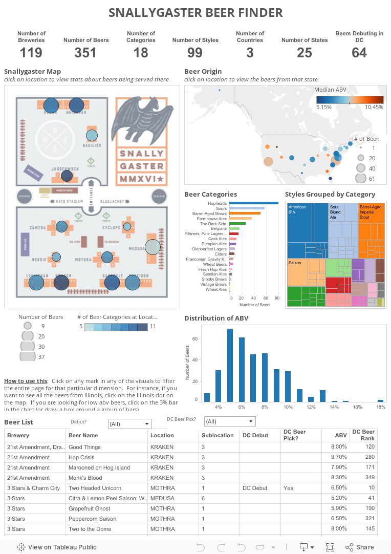
If you haven't been to Snallygaster and love great beer, you are missing out. This year, there are nearly 100 different styles of beers from 120 different breweries (including collaborations). These beers are spread across 13 different stations located in the parking lot across from Nationals Park. With this much territory to cover and all these beers to sort through, figuring out what you want to drink can be daunting. That is why I created this interactive beer finder dataviz.
The Snallygaster organizers have been kind enough to provide a list of the beers and all the associated details via a Google docs spreadsheet. I downloaded the list of beers as well as the map of the Snallygaster site. As you can see below, the list of beers combined with the map of the layout of the event, provides an opportunity to explore the world of Snallygaster beers and figure out where you want to be to get the beers you want on Saturday.
How this works
Everything in the dataviz above is interactive. You can click on a location on the Snallygaster map and see what kind of beers, their origin, their ABV, styles, and even if they are debuting in DC. When you hover over the different marks in the charts above, you will also see additional information (such as the number of breweries for each of the categories and styles). If you are someone who needs to be "the first" and always has to try something new, then you can use the "Debut?" filter (located at the top of the beer list) to choose just the beers that are debuting in DC. If you have a favorite brewery, you can find the brewery in the list at the bottom of the viz and click on the name. Then you can see where all the beers from the brewery are on the Snallygaster map.The map of the US has zoom controls that appear in the corner when you hover over the map. This way you can better zoom in to the east coast where most of the beers originated. By the way Virginia breweries (including collaborations) are bringing the most beers to the event on Saturday. However, each collaboration is treated as a unique brewery so keep that in mind as you are perusing the list and analyzing the results of your "analysis."
For those of you who might be looking for lower ABV beers (there is no shame in that whatsoever) you can use the ABV distribution chart. Not only can you click on the individual bars to view the beers with that ABV, but you can hold the ctrl key while selecting additional bars, or draw a box around the ABV bars you want to select.
As you can see there are lots of ways you can interact with this beer finder dataviz. However, it is best viewed on a monitor, laptop, or a tablet. You can try it on your smart phone, but it might be difficult to select and view the entire viz at once.
See you Saturday at Snallygaster!
Tuesday, September 23, 2014
Silk, Pie Charts, and NFL Arrests
I stumbled into an interesting conversation yesterday on Twitter between a friend of mine and the twitter handle for Silk.co. For those of you not familiar with Silk, it is a website that aggregates datasets that are relevant to current trends and events and provides some simple and easy to use data visualization tools for creating a stories using their data sets.
It all started when Silk published this tweet yesterday afternoon with a chart created from their site using a dataset of NFL arrests since 2000.
It all started when Silk published this tweet yesterday afternoon with a chart created from their site using a dataset of NFL arrests since 2000.
Wednesday, March 12, 2014
A look at salaries for City of Annapolis employees
It is budget time for the City of Annapolis. The new mayor, Mike Pantelides, has proposed a series of job eliminations, furloughs, and lay-offs for the City of Annapolis. The local Annapolis newspaper, The Capital, has done a great public service by publishing the salaries for city employees. And even though I know most of the information is public record, I do have to disagree with their publishing the individual's name alongside the salary data. I think it would have been sufficient to just publish each position without the name or with a non-traceable ID. But I took the data they provided and turned it into a data visualization that you can explore to see exactly which departments comman the highest salaries and employ the most individuals in the city.
Thursday, March 21, 2013
I can't really call it a hiatus...
because I do not post on a regular basis. When I first started this blog, I thought I would be posting at least once a month. But in reality I was doing it about once in a while. And over time I found myself doing more and more hockey related viz.
Consequently, I have been asked to post a weekly column for St. Louis Game Time (a fan run St. Louis Blues hockey blog). This opportunity has created additional opportunities related to hockey data visualization.
I have also been asked to contribute data viz for my organization's website!
So if you are interested in continuing to follow my work, please check out my posts at St. Louis Game Time and keep your eye on the front page of USGBC.org every third and fourth week of the month.
I hope to be back here posting on a semi-regular basis again after the hockey season ends.
Thank you all for reading!
Consequently, I have been asked to post a weekly column for St. Louis Game Time (a fan run St. Louis Blues hockey blog). This opportunity has created additional opportunities related to hockey data visualization.
I have also been asked to contribute data viz for my organization's website!
So if you are interested in continuing to follow my work, please check out my posts at St. Louis Game Time and keep your eye on the front page of USGBC.org every third and fourth week of the month.
I hope to be back here posting on a semi-regular basis again after the hockey season ends.
Thank you all for reading!
Tuesday, February 19, 2013
Thank you for putting me in the top 1% of Tableau authors!
I received an email from Tableau today. It thanked me for being in the top 1% of Tableau Public authors. Really...I'm in the top 1% of Tableau Public authors? That is pretty fantastic and I have all of YOU to thank for it. I really have appreciated all the support I've received from friends, colleagues, and fellow Tableau users. Many of you have RT my postings on Twitter. Some of you have posted a link to my blog on your site. Whatever the case may be, I am grateful for all the support, feedback, and visitors I have received at this site.
Sunday, February 17, 2013
Hockey Day Across America 2013
Last year for Hockey Day Across America, I took a look at the birthplaces of NHL players whose teams were playing on Hockey Day Across America. I decided to update the visualization this year but just focusing on the number of US born players that are currently playing in the NHL during the abbreviated 2012-2013 season.
Friday, January 4, 2013
What states do hockey players come from in the US?
As a hockey fan, I follow several hockey bloggers and hockey reporters on Twitter. Earlier today, hockey writer James Mirtle from The Globe and Mail tweeted out a link to a very well organized Google Docs spreadsheet (with a nice chart embedded) in which he had compiled stats regarding where hockey players have come from within the United States. Since there isn't much other hockey stats going on right now with the lockout I'm looking for all sorts of other hockey related data viz projects and took advantage of the data he made available.
Monday, October 15, 2012
Where are they now? NHL players abroad during the 2012-2013 lockout.
This is not a good time for hockey fans. When the collective bargaining agreement between the NHL owners the the NHL Players' Association expired and no new agreement had been reached, the owners decided to lockout the NHLPA. This has resulted in a delayed start to the season and a possible repeat of the 2004-2005 season when the entire season was scrapped.
As the lockout became more and more certain, NHL players who were originally from Europe started to head back home and sign contracts to play with teams back in their home countries. As the exodus of players continued, lists started to be compiled to allow fans to keep track of which players were playing for which teams. However, most of these lists have been unable to tell the complete story of how many players are playing for which leagues and teams and in which cities and countries.
As the lockout became more and more certain, NHL players who were originally from Europe started to head back home and sign contracts to play with teams back in their home countries. As the exodus of players continued, lists started to be compiled to allow fans to keep track of which players were playing for which teams. However, most of these lists have been unable to tell the complete story of how many players are playing for which leagues and teams and in which cities and countries.
Wednesday, August 1, 2012
Olympic Medals: Counts and Scoring
First, let me start by saying that I love watching the Olympics. I prefer the winter, but I am just as involved in the summer games. I would consider qualifying to attend the Olympics as a competitor a major life accomplishment let alone winning any sort of medal. These athletes spend most of their lives up to that point honing their skills in order to succeed in their sport. It is amazing to watch them compete, regardless of the sport.
Friday, July 6, 2012
Chesapeake Bay Water Quality Viz
I am not a scientist nor do I have a background in the "hard sciences" (my degree is in Political Science). However, I am a strong advocate for the Chesapeake Bay and have been actively involved in a variety of activities and organizations that are trying to clean up, preserve, and protect the Chesapeake Bay.
The Chesapeake Bay is the largest estuary in North America. At one time it was teeming with fish, crabs, and oysters. However, after centuries of water pollution, air pollution, over-development along its shores, over-fishing, and agricultural runoff, it is currently in a very distressed condition.
I am currently conversing with a local watershed group about using Tableau as a tool to visualize the data that this specific local group collects about their waterway. People are always wanting to know the condition of the waterway either out of general concern, or because they want to know if it is okay to swim or fish in the water. During our initial conversation they recommended that I take a look at the data that the Chesapeake Bay Program makes available to the public. So I downloaded a set of data focusing on three primary metrics: dissolved oxygen, secchi disk depth, and water temperature.
Wednesday, May 9, 2012
Hartigan's Hockey Team Ratings
A while back hockey fan extraordinaire @StephHartigan ranked NHL teams by her own set of personal criteria. As I am always looking for new, unique data sets to play with in Tableau, she graciously provided me with a google docs spreadsheet of her rankings. I took her team rankings and turned it into an interactive viz that she can share with her friends so they can have a better understanding of why she might choose one team over another.
Tuesday, May 1, 2012
Birds Do It, Bees Do It Part 2
Everyone makes mistakes. Unfortunately, it seems like I make more mistakes than most. Also, sometimes it seems I make more obvious mistakes than others. Such is the case with my "Birds and Bees" viz from last year.
Thursday, April 26, 2012
Tableau Biz Viz Contest Entry: A Click-through History of Venture Capital Investment Deals
Tableau is holding one of their regular visualization contests. Their Interactive Biz Viz Contest challenges Tableau users to take business data (any business data) and turn it into an informative, interactive data visualization using Tableau. They give you some suggestions for data sets that are available. I chose venture Capital data from the National Venture Capital Association. Check it out...
Tuesday, April 17, 2012
NHL Player and Team Stats v2.0
The 2011-2012 NHL regular season is finished, and the first round of the playoffs is well underway. During the latter part of the hockey season, I took some time to revise and update my original NHL player stats data viz. I ended up with something radically different than what I created last summer for the Tableau sports data contest. It is not #fancystats, like what Neil Greenberg specializes in, but I think looking at hockey data in this format is fun and informative. Check it out...
Monday, February 20, 2012
Player Nationalities for Hockey Day Across America
Yesterday, the NHL participated in USA Hockey's Hockey Weekend Across America with their own Hockey Day Across America activities. For hockey fans, such as myself, it is great to see the sport of hockey being promoted in the United States. The day featured some great games on national television, and had special events around the country to encourage kids and families to try out hockey for the first time.
The television line up featured three great games: St. Louis Blues vs Chicago Blackhawks, Pittsburgh Penguins vs. Buffalo Sabres, and the Detroit Red Wings vs. San Jose Sharks. There was only one disappointment however -- the Red Wings dominated the airwaves yesterday. (Full disclosure: I am a St. Louis Blues fan which means I am very much biased against the Red Wings.) In fact, Laura (@hildymac), from the blog Thrashing the Blues, and I had a Twitter conversation about this most disturbing aspect of HDAA. As an out-of-town Blues fan, it is rare that we get to see them on national TV. After all, the Blues/Blackhawks rivalry is a great rivalry, and as Laura duly noted there were quite a few US born players on both the Blackhawks and Blues teams. So why not give the Blues/Blackhawks game more national coverage instead of giving it mainly regional coverage?
This got me to thinking...
The television line up featured three great games: St. Louis Blues vs Chicago Blackhawks, Pittsburgh Penguins vs. Buffalo Sabres, and the Detroit Red Wings vs. San Jose Sharks. There was only one disappointment however -- the Red Wings dominated the airwaves yesterday. (Full disclosure: I am a St. Louis Blues fan which means I am very much biased against the Red Wings.) In fact, Laura (@hildymac), from the blog Thrashing the Blues, and I had a Twitter conversation about this most disturbing aspect of HDAA. As an out-of-town Blues fan, it is rare that we get to see them on national TV. After all, the Blues/Blackhawks rivalry is a great rivalry, and as Laura duly noted there were quite a few US born players on both the Blackhawks and Blues teams. So why not give the Blues/Blackhawks game more national coverage instead of giving it mainly regional coverage?
This got me to thinking...
Wednesday, February 8, 2012
FDIC Bank Closings -- Tableau Demo for Work
Some of the staff where I work are interested in a demo of Tableau. Basically they want to know what it is, how does it work, and how we are using it. So I downloaded the FDIC Failed Banks list from Data.gov and used this data set to show them how easy it is to create a quick interactive data visualization that can be embedded into a blog post. I actually made this right in front of them as part of the demo. It took about 10 minutes max.
Friday, February 3, 2012
“You miss 100% of the shots you never take.”
I love that quote from Wayne Gretzky even though it is obvious and has become a bit cliche'.
The St. Louis Blues had a little bit of extra time off after the All-Star game. Tonight is their first game since the break. I wanted to publish one more data viz before they started back up again. After that, I will probably wait till the end of the season to publish any additional hockey data visualizations.
This visualization is taking a look at their goal scoring (or as many Blues' fans would say -- their lack of goal scoring). They need to score more goals if they want to remain competitive for the remainder of the season and (hopefully) the playoffs. So I put together something that shows who has the best goal percentage, goals per game, which players need to improve their goal scoring ability, and which players need to shoot the puck more!
The St. Louis Blues had a little bit of extra time off after the All-Star game. Tonight is their first game since the break. I wanted to publish one more data viz before they started back up again. After that, I will probably wait till the end of the season to publish any additional hockey data visualizations.
This visualization is taking a look at their goal scoring (or as many Blues' fans would say -- their lack of goal scoring). They need to score more goals if they want to remain competitive for the remainder of the season and (hopefully) the playoffs. So I put together something that shows who has the best goal percentage, goals per game, which players need to improve their goal scoring ability, and which players need to shoot the puck more!
Monday, January 30, 2012
St. Louis Blues Players Performance at the All-Star Break
The NHL All-Star break is the perfect time to get caught up on player stats and to take a look at their performance during the first half of the season. I haven't published anything for a while and I've been dying to do a hockey viz. So I took advantage of the empty schedule, scraped the data, and here are the results.
Sunday, December 18, 2011
PNC 12 Days of Christmas Price Index
Since 1984, PNC Bank has been issuing their 12 Days of Christmas Price Index. This index is comprised of the costs of all 12 gifts in the song from the 12 Days of Christmas. I have heard of the index in the past, but didn't know that it was PNC who put it together or that they have been doing so since 1984. They have a really fun website this year that involves interactive flash video. You should definitely right click on this link and "open in new tab" and go check it out. I'll wait for ya...
PNC 12 Days of Christmas Price Index
I would think this could be fun for children or (if you are like me) those who are a child at heart.
Fortunately, PNC makes their historical data (.xls file) available for the general public. So in an effort to spread some Christmas cheer via interactive data visualizations I put together a dashboard of sorts to explore the Christmas Price Index from 1984 till 2011.
PNC 12 Days of Christmas Price Index
I would think this could be fun for children or (if you are like me) those who are a child at heart.
Fortunately, PNC makes their historical data (.xls file) available for the general public. So in an effort to spread some Christmas cheer via interactive data visualizations I put together a dashboard of sorts to explore the Christmas Price Index from 1984 till 2011.
Subscribe to:
Posts (Atom)